Words & layout is the smallest group and the one that does the most work. Nothing in it is gated, nothing in it collects an answer, and nothing in it needs anything set up first.
The six blocks
- HeadingFree
- A title or section header. Fields: Heading text, Level, and alignment. Use Level to build a real hierarchy rather than making one heading bigger than the rest by feel: the level is what a screen reader announces.
- TextFree
- Body copy with formatting. Fields: Text content and alignment. The rich toolbar gives you bold, italic, inline code and links, plus the green Answer button that drops a remembered answer into the sentence.
- AccordionFree
- Expandable sections: menus, FAQs, house rules. Fields: Accordion Items (a title and a body per row) and alignment. Everything is collapsed when the page loads, so a long list costs one screen instead of ten.
- Promo BoxFree
- A coloured callout for the one thing that changes. Fields: Text, Background color, Text color. Deliberately loud, which only works if there is one of them.
- ButtonFree
- A link button. Fields: Label, Destination and Style. The destination picker takes one of three kinds (a link, an email address or a phone number) and writes the right sort of href for each. Buttons keep the 2px corner the rest of NearField uses.
- DividerFree
- A horizontal rule. No fields at all. It exists to give the eye somewhere to rest between two dense sections.
Writing text that changes per visitor
Heading, Text, Button, Promo Box and each Accordion row read remembered answers. Press the green Answer button in the toolbar, pick the answer, and give it a fallback: the word shown to somebody who never answered the question.
Written as {{name|Guest}}, that renders as Welcome back, Sarah. for Sarah and Welcome back, Guest. for the person who walked straight past the first Marker. Always set a fallback. Without one, an unanswered question leaves a gap in the sentence rather than a word.

{{name|Friend}}, meet the otters in the builder. This is the fallback doing its job for a visitor who never gave a name.Accordion, and when to use one
The Accordion is the most under-used block in the library. Anything that is a list of question-and-answer pairs belongs in one: allergens, house rules, ticket types, what to do if it rains.
Example
Marigold & Vine: the allergen accordion
The Marker sits in the middle of the table. A guest with a nut allergy taps it and needs one specific answer, fast, without reading the whole menu.
- One Accordion block with six rows: nuts, dairy, gluten, shellfish, egg, sesame.
- Each row's title is the allergen. Each body lists the dishes that contain it, and the two the kitchen can adapt.
- Above it, one Heading: Allergens and dietary notes.
- Below it, a Text block with the line the kitchen wants said out loud: tell your server, every time, because we cook in a shared kitchen.
The alternative was six Text blocks and six Headings, which is twelve blocks and a page nobody scrolls to the bottom of. The Accordion is one block, and the guest sees six words until they tap the one that matters to them.
Promo Box, and when to use one
A Promo Box is a colour change, and colour changes only mean something when they are rare. One per page. If a second thing on the page deserves a Promo Box, the first one probably did not.
Example
Ridgewood Museum of Natural History: the closing-soon box
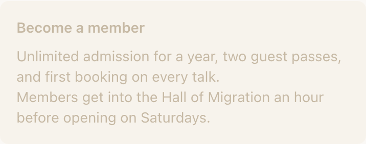
The Hall of Minerals closes for rebuild on 14 October. Ridgewood wants everybody who taps any Marker in that hall to know, without rewriting nine Experiences.
One Promo Box at the top of each Experience in the hall: Last chance: this hall closes for rebuild on 14 October. Ochre background, dark text. It is the only coloured thing on the page, so it reads in the first half-second.
A Text block would have said the same words and been read by nobody, because it looks exactly like the two paragraphs under it. That is the whole difference between the two blocks.
Button, and its neighbours
A Button opens a link. That is all it does, and it is the right answer whenever the destination is genuinely just a page: your ticketing site, an Instagram profile, a newsletter sign-up you already run.
It is the wrong answer when a purpose-built block exists. Directions opens the visitor's own maps app rather than a maps web page. Call dials. File opens a PDF inside the Experience instead of dumping it into a browser tab. Those blocks also record what happened, which a Button pointing at the same destination cannot.
Can I change the font or the colours of a Text block?
Not per block. Type and colour come from the Experience theme on the Brand tab, so a page stays coherent when six people have edited it. The Promo Box is the deliberate exception: it has its own background and text colour, because its whole job is to look different.
How many Accordion rows is too many?
Around a dozen. Past that the collapsed list is itself a wall of text, and the content usually wants splitting into two Accordions under two Headings, or into a File, if it is really a document.
Does a Divider do anything besides draw a line?
No. It has no fields and no settings. If you want a labelled break rather than a silent one, use a Heading instead: it gives the section a name and puts it in the page structure.