Organisation details
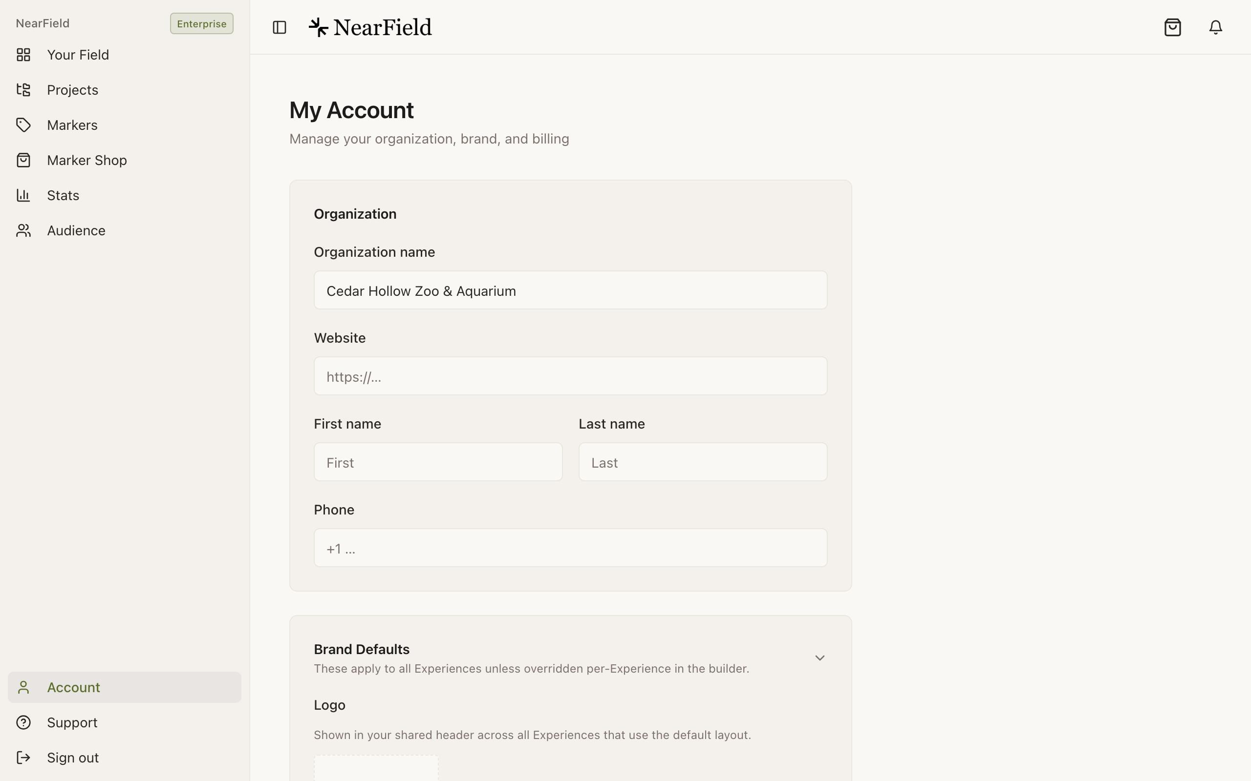
The top of Account holds your organisation name, website, your own first and last name, and a contact phone number. They save as you type: a small confirmation appears when they land.
The organisation name is not just paperwork. It titles a shared stats report, and it appears in the emails NearField sends on your behalf, so it is worth writing the way a visitor would recognise it.
Brand defaults
Four settings apply to every Experience unless a specific one overrides them in the builder.
- Logo
- PNG, JPEG, WebP or SVG. It shows in your shared header on every Experience using the default layout.
- Primary colour
- Buttons and the main interactive colour.
- Secondary colour
- Supporting elements.
- Background
- The page colour behind your Experiences. Text, cards and dividers adjust themselves to stay readable on it. Leaving it empty is a real setting meaning the standard page colour, and there is a Clear button to get back there.
The shared header and footer
Under Default Layout you can build a header and a footer once and have them appear on every Experience that has the default layout enabled. Eight block types are available: heading, text, image, button, divider, sponsor, social and promo.
This is where a logo lockup, an opening-hours line, a sponsor credit or a link back to your own website belongs: anything that should look identical everywhere and change in one place.
The shared header and footer is on every plan, including Free: there is no plan check anywhere in the product. It was sold as a paid feature for a while; the pricing page now says what the code does.
Example
Marigold & Vine, one footer across every table
The restaurant runs one Experience per table plus a menu page and a Wi-Fi Action. The footer holds the same three things on all of them: opening hours, a link to book, and the accessibility note about step-free access to the terrace.
When the winter hours start, one edit in Account changes every page. The tables are not touched, and nothing is republished by hand.
How do I stop the shared layout appearing on one Experience?
Turn the default layout off for that Experience in the builder's settings. It keeps your brand colours and drops the shared header and footer.
My logo looks wrong on a dark background.
Upload a version with transparency, or set the background colour to something the logo was drawn for. The rest of the page adapts to the background; an image cannot.
Can I use a custom domain for my Experiences?
Not today. Experiences live on NearField addresses, and a Marker points at one of those.