The Inclusion Bar is fixed to the bottom of a published Experience. It is not an add-on, not a widget bolted on by a third party, and not gated: every plan gets all of it, including the free one.
Live example · Ridgewood Museum of Natural History
Open full sizeThe three controls
- Translate
- Opens a language list showing each language in its own script with the English name underneath. 20 languages, covered in languages and read-aloud.
- Adjust
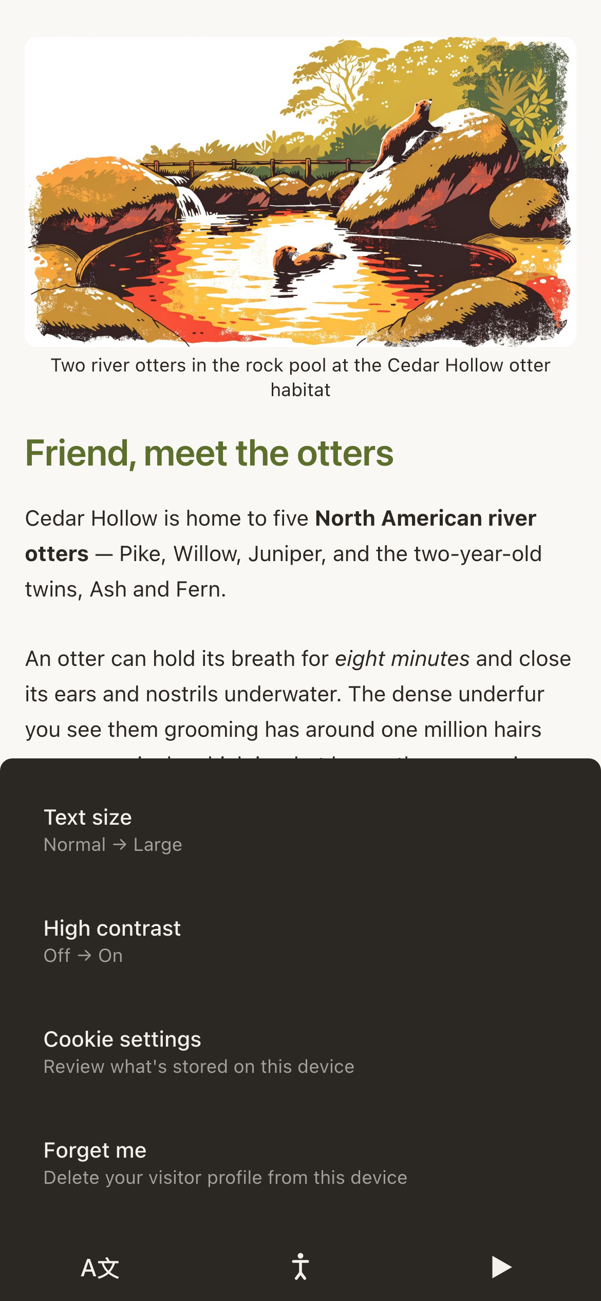
- Text size, high contrast, and the visitor's own privacy controls.
- Listen
- Reads the page aloud, with a playbar carrying stop, elapsed time and a seek slider. Only appears when you have chosen a voice for the Experience.
What Adjust actually offers
| Row | What it does |
|---|---|
| Text size | Cycles through Normal, Large and Larger, scaling the whole page. |
| High contrast | Switches the page to white on black. Every block has its own high contrast palette, so nothing goes missing. |
| Cookie settings | Reopens the consent panel so a visitor can change their mind. |
| Forget me | Deletes the visitor's profile from that device: every answer they have given you, gone at their request. |
Turning it on and off
- 1
Open the Settings tab in the builder
The switch is called Inclusion Bar.
- 2
Decide whether to show icon labels
With labels on, the words Translate, Adjust and Listen appear beneath the icons and the bar is slightly taller. Labels help every first-time visitor and cost about 16 pixels.
- 3
Choose a read-aloud voice, or Off
Off hides the Listen control and leaves the other two.
Why pinch-zoom is disabled
On Experience pages, pinch-to-zoom is deliberately turned off and replaced by the text size control. Pinching a phone page zooms the layout and leaves a visitor scrolling sideways through a paragraph; the text size control reflows the page instead, which is what somebody with low vision actually wants. The rest of NearField stays pinch-zoomable.
What the bar cannot do for you
The controls make a well-built page reachable by more people. They cannot rescue a page that was built carelessly. Four things are yours:
- Write alt text on every image. The field is in the image block's editor. Describe what the picture shows, not what it is called.
- Do not put words inside pictures. Text baked into a JPEG cannot be translated, resized or read aloud. Put it in a text block above the image.
- Check your colours. A pale primary on a pale background passes nobody. Try the page in high contrast before you publish.
- Caption your video and audio. NearField will read your page aloud; it will not caption your media for you.
What is built in
- Every control carries a spoken label for screen readers.
- Sheets and banners are announced as dialogs and trap focus properly.
- Inputs are sized so that iOS does not zoom the page when a visitor taps into them.
- Buttons and rows meet a comfortable minimum tap size, and clear the phone's own bottom toolbar.
- Animation is reduced automatically for visitors whose device asks for it.
Example
Harbour Point Aquarium
Harbour Point runs school groups four mornings a week, and turned icon labels on across every Experience after watching a class of nine-year-olds ignore three unlabelled icons for a full minute. The same setting helps the grandparents who visit at weekends. It cost them one switch and a slightly taller bar.
Does the Inclusion Bar cost extra?
No. It is on every plan including free, and it always has been. There is no upsell inside it.
Can I change the bar's colours?
The bar has its own account-level colour rather than following each Experience's palette, so it stays legible and recognisable wherever it appears.
Does it work with a screen reader?
Yes: the page is ordinary, semantic HTML with labelled controls, so VoiceOver and TalkBack read it. Read-aloud is a separate thing, for visitors who are not running a screen reader at all.
Can I hide it on one Experience only?
Yes. The switch is per Experience, in the Settings tab, so a page that genuinely needs the full screen can turn it off while the rest of your account keeps it.