Every Experience inherits your account's brand until you tell it not to. That default is usually right: an organisation with nine Experiences wants nine pages that look like one organisation.
The Brand tab
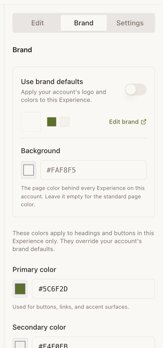
Open an Experience and choose Brand in the right rail. At the top is a switch reading Use brand defaults, with a summary row showing your account logo and swatches and an Edit brand link through to Account.
Leave the switch on and this Experience follows your account. Turn it off and it gets its own three colours, seeded from the account palette so that nothing snaps visually at the moment you flip it.
The three colours
- Primary
- Buttons, links and accent surfaces. This is the colour a visitor reads as “yours”. Defaults to Ivy,
#5C6F2D. - Secondary
- Headings and supporting surfaces: the quieter half of the pair. Defaults to a warm off-white,
#F4F0EB. - Background
- The page colour behind everything. Leave it empty and the standard warm page colour is used. Text, cards and dividers derive themselves from whatever you set, so a dark background does not need a second round of adjustments.
Each takes a swatch from the picker or a typed six-digit hex code, written with the leading hash. Three-digit shorthand is not accepted.
Live example · Ridgewood Museum of Natural History
Open full sizeAccount brand versus this Experience
There are two levels, and the Brand tab shows both, which is the part that trips people up.
| Set in | Applies to | Use it for |
|---|---|---|
| Account → Brand Defaults | Every Experience that has not overridden it | Your logo, and the palette you want everywhere. |
| Builder → Brand tab, with defaults off | This Experience only | A seasonal page, a sponsor takeover, one gallery with its own identity. |
An unset background is not the same as white
Empty is a real, distinct state meaning “use the standard page colour”, and it is not the same as typing #FFFFFF. If you have set a background and want it gone, use the Clear button rather than typing a colour you think looks similar.
Choosing colours that hold up on a phone
- Test outdoors if the Marker is outdoors. A pale grey on cream is legible at a desk and gone in daylight.
- Do not carry meaning in colour alone. Some of your visitors will be reading the page in high contrast mode, where your palette is replaced entirely by black and white.
- Keep the primary saturated enough to read as a button. A very pale primary makes every call to action look disabled.
- Change one thing at a time. The middle column updates live, so set the background, look, then set the primary.
Example
Marigold & Vine
Marigold & Vine set their account brand once (deep green primary, cream background, logo) so every table tent, the takeaway page and the private-dining page match without being configured. The one exception is their seasonal set menu, where brand defaults are switched off and the background is a warm ochre for six weeks, then switched back.
Can I change the font?
No. Type is fixed so that every Experience is legible at arm's length on any phone, which is the situation nearly all of them are read in.
Can I use a background image?
No: the background is a colour. A full-width image at the top of the page, as an image block, gets you most of the same effect without hurting the text underneath.
Is there a dark mode?
There is no automatic dark mode, but a dark background colour is fully supported: set one and the text, cards and dividers adjust to stay readable on it. Visitors also have a high contrast switch of their own in the Inclusion Bar.
Do my colours apply to the Inclusion Bar?
The bar has its own account-level colour and sits deliberately apart from your palette, so it stays recognisable and legible whatever the page behind it is doing.