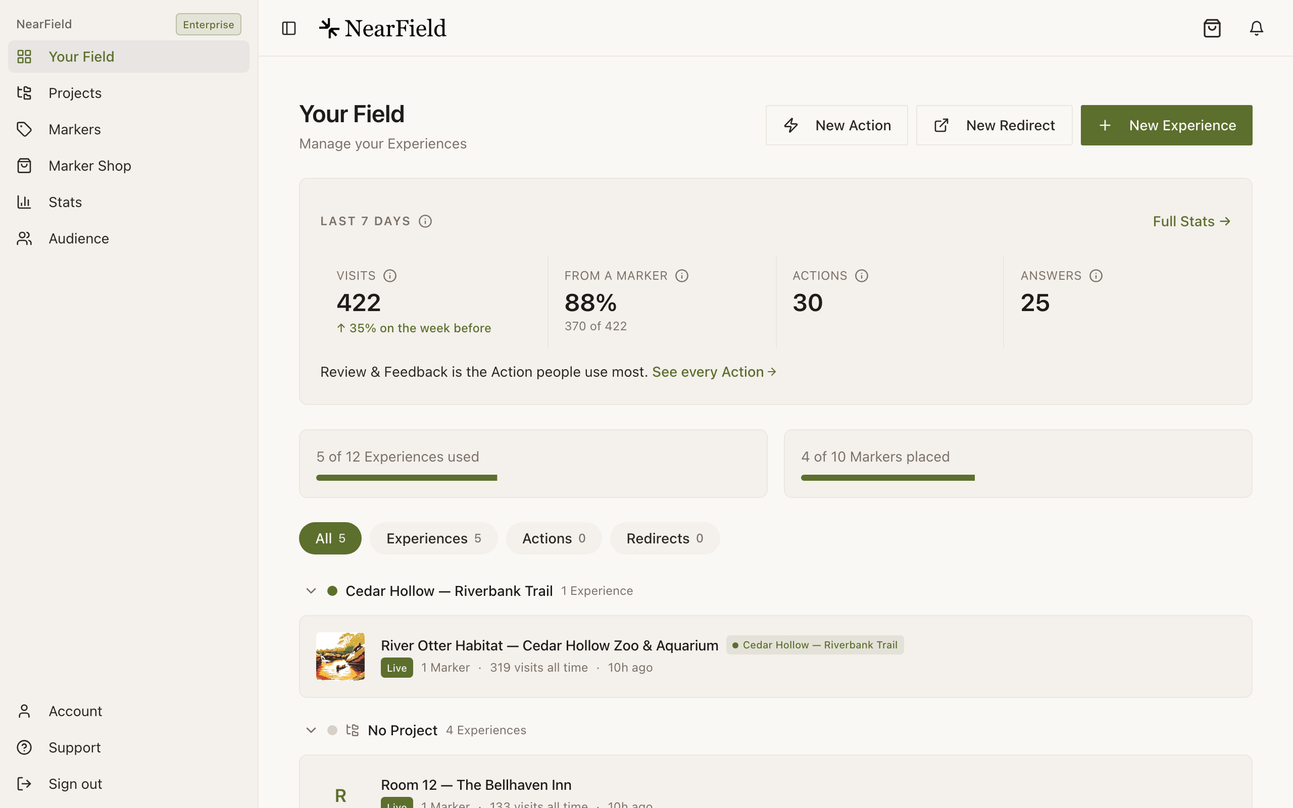
The workspace is titled Dashboard, and its subtitle, “Manage your Experiences”, is a fair description of the whole job. Everything else in the app is reachable from the rail beside it.
The sidebar
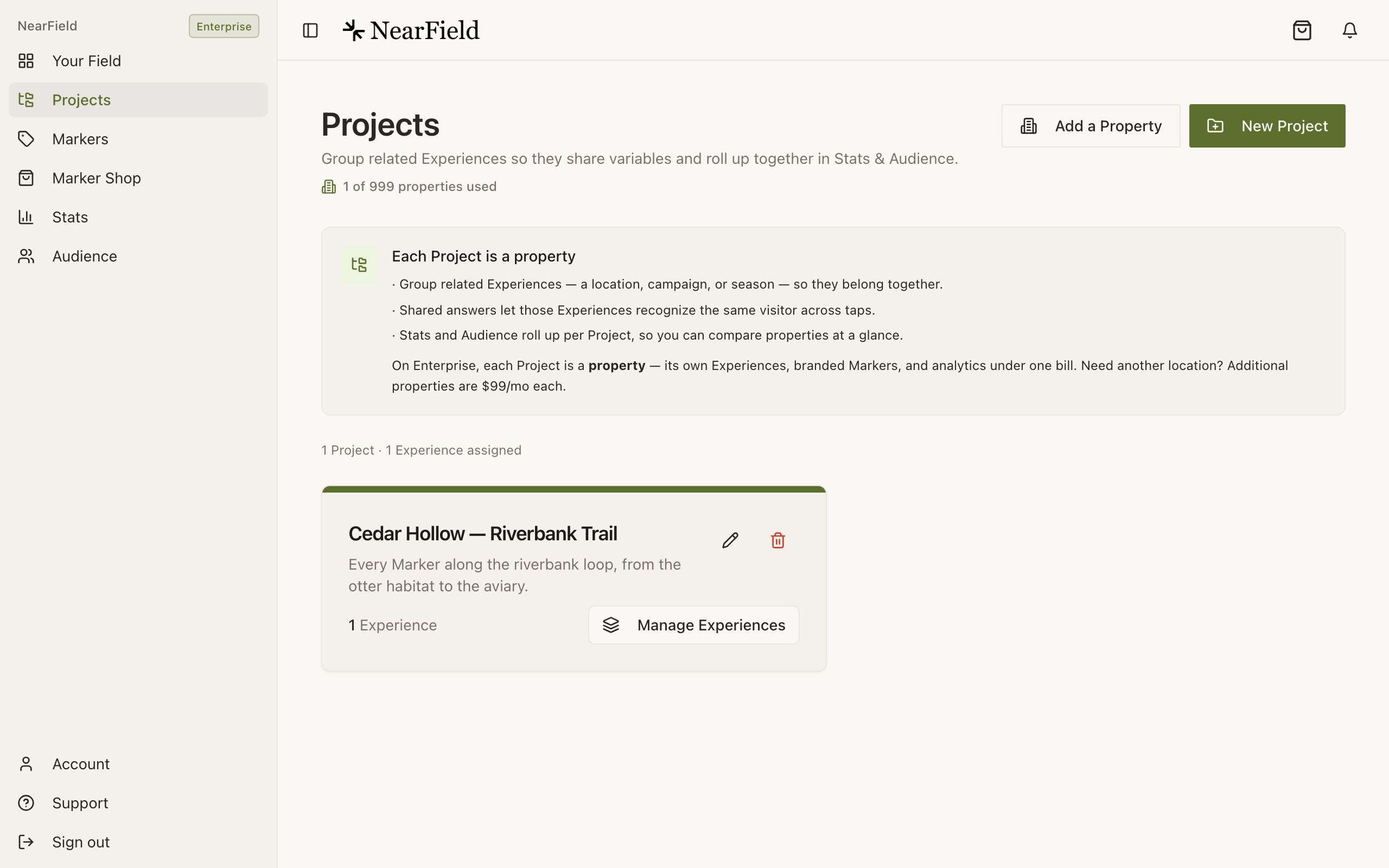
Six places, in the order you meet them:
- Dashboard
- Every Experience, Action and Redirect you have made.
- Projects
- Groups of Experiences that share answers and roll up together in Stats. A hotel with three buildings, a museum with four galleries.
- Markers
- Your physical Markers: registering, naming, linking, relinking and disconnecting them.
- Marker Shop
- The catalogue, inside your workspace, so checkout already knows who you are.
- Stats
- Visits, taps, scans, Actions and answers over a date range you pick.
- AudienceStarter
- The people rather than the pageviews: who answered what, and when they came back.
At the bottom of the rail: Upgrade (hidden if you are already on Enterprise), Account, Support, and sign out. The group label carries your plan badge, which is the quickest way to check what tier an account is actually on.
Last 7 days
The strip at the top of your dashboard is a fixed window, Last 7 days, in the words of its ⓘ, “Visits, Marker share, Actions and answers from local midnight seven days ago until now. The same window as picking 7 days on Stats.” It carries the same four tiles as Stats, Visits, From a Marker, Actions and Answers, each with the same ⓘ, and a Full Stats link. On a paid plan the Visits tile also says how it compares with the week before.
Underneath the tiles sits one ranked insight: the single most useful thing NearField can currently say about your account, with a link that takes you to the place you would fix it. When nothing has arrived for a week, the strip leads with that instead: “Last visit 12 days ago.” above the tiles, with a Check your Markers link.
The two meters
Next come your allowances: “2 of 3 Experiences used” and “4 of 10 Markers placed”. These are the numbers your plan actually enforces, and the first one counts everything: an Action and a Redirect each take a slot exactly as a full Experience does.
During the trial a banner sits above the meters with the days left and what happens on day 14, such as Free trial: 9 days left, and a Your plan button. After the trial it says Your free trial has ended and how many features visitors can't see.
The nudge card
At most one card shows at a time, and it is always the next thing worth doing: your Markers have shipped and want their PINs entered, an Experience is live but has no Marker pointing at it, a design you made in Marker Studio has never been ordered. Dismiss it and it stays dismissed on every device, including the iPhone app.
The list itself
Each row shows a thumbnail, the name, a Live or Draft badge, and a meta line: how many Markers point at it, how many visits it has had all time, and when it last changed. On the right is one contextual button that changes with the state of the Experience:

| State | Button | What it means |
|---|---|---|
| Draft, no blocks | Start building | Created but empty. Nothing to publish yet. |
| Draft, has blocks | Ready to publish | Finished enough to go live. Nothing is public until you do. |
| Live, no Markers | Place a Marker | Reachable by link only. The physical half is missing. |
Hovering a row on a desktop, or opening its overflow menu on a phone, gives you edit, open the live page, Copy link, Move to Project and delete. Copy link gives you the short form, getnearfield.com/e/abc123defg, which is the one to use in print.
Grouping by Project
With no Projects the list is flat. Create one and your dashboard grows filter chips (All, Experiences, Actions, Redirects) and collapses into one section per Project, with anything unassigned under “Not in a Project”. Projects are unlimited and free on every plan except Enterprise, where each Project is billed as a property.
The loop
Build
Stack content blocks into an Experience. Free, and no card.
Preview
Open it on your own phone before anyone else sees it.
Publish
It gets a public link that works anywhere you can paste a URL.
Make it physical
Point a Marker at it and put the Marker where the question gets asked.
Then it starts again. Stats tell you which Markers get used and which questions visitors keep asking, you change the Experience, and the Marker on the wall is already pointing at the new version. Nothing gets reprinted.
Why can I not find the latest visitor moments here?
They are on the Audience page, under Overview, as “Latest on the timeline”. Your dashboard's equivalent is the “Last 7 days” strip at the top.
The Experience list is empty but I built something.
You are probably signed into a different account from the one you built in: work started before sign-up belongs to a temporary session until an email is attached to it.
Can I reorder the Experience list?
No. It is ordered by recent activity, and grouped by Project when you have Projects. Naming things well is the lever you have.