Open Stats and the subtitle tells you what the page is for: how many people found you, and what they did once they did. Everything on it is arranged in that order: reach, then action, then knowledge.
Read it in this order
- 1
Set the range first
The picker offers Today, 7 days, 30 days, 90 days and All time, and starts on 30 days. Your choice is remembered, and it is the same choice on each Experience report and on Audience, so drilling into one Experience keeps the range you were reading. Every number and sentence below the picker is scoped to it, so changing it last means re-reading everything.
- 2
Read the four tiles across, not down
They are ordered reach → action → knowledge, and they are meant to be read as a sentence: this many visits, this share from a Marker, this many Actions, this many answers. The line above them says the same thing in words.
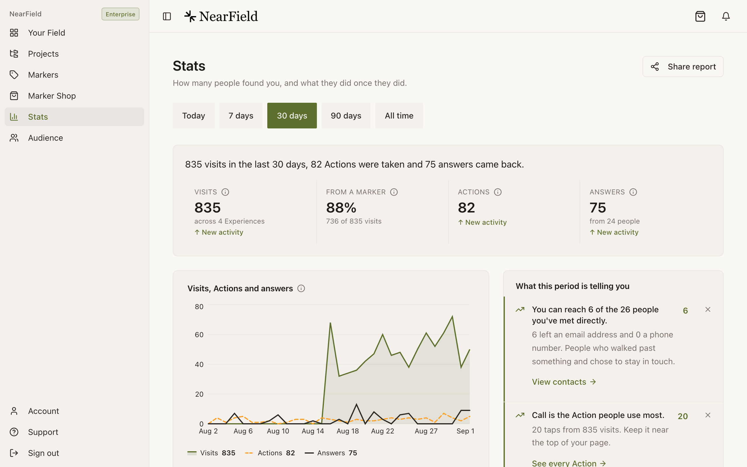
Range first, then the four tiles left to right. - 3
Read the insight cards
The section headed What this period is telling you is the page's own reading of the numbers above it. Start here if you only have a minute. Three cards show at first, and Show 4 more (or however many there are) opens the rest.
- 4
Drop into the table
Your Experiences ranks everything that had a visit, an answer or an Action in the range. Sort by Visits, Actions or Answered to find the row that is carrying the account, and the row that is not.
- 5
Open the worst row
Tap any row for its full report. A weak Experience is a page problem; a strong Experience with no Marker visits is a placement problem, and those are fixed in completely different ways.
The four tiles
Stats, each Experience report and the Last 7 days strip on your dashboard lead with the same four tiles, in the same order, meaning the same thing. Each has an ⓘ beside its name: tap it to see how that number is counted. On a computer it opens a small card; on a phone and in the app it slides up from the bottom, with Got it to close it. Here is what each one says, word for word:
- Visits
- "Each time one of your Experiences is opened: a Marker tap, a QR scan or a link. The same person coming back counts again." Underneath, how many Experiences those visits were spread across.
- From a Marker
- "The share of visits that came through one of your Markers, whether someone tapped it, scanned its printed code or opened its link. The rest came another way, such as a link you shared or the QR code you get when you publish." Underneath, the count behind the percentage: "736 of 835 visits". This is the number that tells you the hardware is doing its job. As the ⓘ adds, "It counts Markers, not how a visit started, so it can differ from NFC taps plus QR scans under How people found you."
- Actions
- "Taps on an Action button: Wi-Fi, Call, Directions, Pay and the rest. Every tap counts, including taps from visitors who never told you who they are." Money rides underneath rather than taking a tile of its own ("$240 collected") because, as the ⓘ adds, "Pay and Donate count the tap. Money that actually arrived shows as collected." With no money in the range, the line underneath says how many taps completed, when that differs from the taps.
- Answers
- "Replies to your questions: names, ratings, choices and anything typed in. One person answering three questions is three answers." Underneath, how many people gave them.
On a paid plan, Visits, Actions and Answers carry a period-over-period delta: "↑ 12% vs previous period", or "↑ New activity" when the period before had none. A delta compares the range you are looking at with the one immediately before it, so 7 days compares against the previous 7 days. All time has no period before it, so it shows none. Each Experience's report carries the same three deltas, counted for that Experience alone.
When nothing has arrived for a week
If your account has had visits before but none in the last seven days, Stats says so before anything else. A banner above the period picker reads "Last visit 12 days ago.", then "Nothing has arrived in the last 7 days. Check that your Markers are still in place and linked to a published Experience.", with a Check your Markers link.
It is about the last seven days whatever range you pick, and it cannot be dismissed: a Marker that has gone dark is not a suggestion. Each Experience report shows the same banner for its own visits, and the Last 7 days strip on your dashboard leads with a short version of it.
What this period is telling you
The insight cards are ranked, not listed. One engine produces them for Stats, for each Experience report, for Audience and for the Last 7 days strip on your dashboard, and it follows three rules: never claim a pattern without enough data behind it, never say a number that contradicts one elsewhere on the page, and always end with something to do. A card that would only repeat a tile above it is left out.
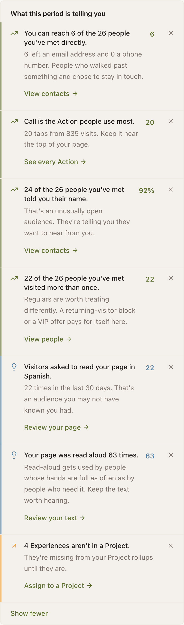
| Tone | Means | Example |
|---|---|---|
| Needs attention | Something is broken or falling | "Visits fell 30%, from 120 in the period before to 84." |
| Opportunity | Nothing is wrong, something is missing | "Every visit so far came from a link, not a Marker." |
| Working well | Keep doing this | "Call is the Action people use most." |
| Worth knowing | Context you would not have guessed | "Visitors asked to read your page in Spanish." |
Dismiss a card and it stays gone for a week on that device. Dismissals are a per-device preference, not a change to your data. The same card can still appear on your phone.
How many cards you see depends on the plan: two on Free, four on Starter, every card on Growth and Enterprise. During the 14-day free trial, a free account sees what Growth sees. Where a higher plan would show more, the foot of the panel says how many: "3 more findings from this period are waiting on a higher plan."
The charts
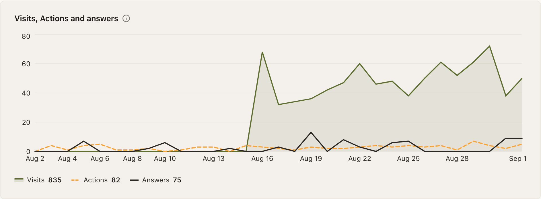
- Visits, Actions and answers: one chart, counted by your local clock: by the hour for Today, by the day up to about four months, and by the week beyond that. Every day in the range is drawn, quiet ones included. Visits is the filled line, Actions the dashed one and Answers the dark one, and the legend underneath repeats each total. Below Growth the chart shows visits alone, under the title Visits.
- Actions: every Action with its taps, how many completed where that differs, and its share of visits, under a total like "82 taps from 835 visits".
- How people found you: one bar split into NFC tap, QR scan and Link, plus Builder QR once someone has scanned the QR you get when you publish, with the count for each written beside it.
- By Project: visits and Actions added up across each Project's Experiences, with anything unassigned in a Not in a Project row at the end. It only appears once you have at least one Project.
Your Experiences, and the health score
The table lists every Experience with a visit, an answer or an Action in the range: its visits, how they split between NFC, QR and Link, its Actions, and Answered. Answered is people over people, so "24 of 26" means 24 of the 26 people you met on that Experience answered something. On a phone each Experience becomes a card, with its name in full and the source split drawn as a thin bar.
Paid plans add a Health column. Its ⓘ reads: "A score out of 100 for each Experience: up to 40 points for the share of people who answered, 20 for the share who told you their name, 20 for the share who came back, and 20 for how many answers each person gave." Under five visits it reads New rather than guessing.
| Score | Badge | What to do |
|---|---|---|
| 70 and above | Strong | Copy what this page does onto a weaker one |
| 40 to 69 | Growing | Add one question or one Action and watch it again |
| Below 40 | Needs work | Usually a page that asks nothing, so visitors have no reason to touch it |
The row with the best answered share (at least five visits, and at least one person in twenty answering) is marked Most answered. A row with ten or more visits where fewer than one person in twenty answered gets a warning triangle instead, and that is the one to open first. A row never carries both marks.
What each plan shows
| Free | Starter | Growth | |
|---|---|---|---|
| Tiles and insight cards | Yes, 2 cards | Yes, 4 cards | Yes, every card |
| Charts, sources, Experience table | No | Yes | Yes |
| Deltas and health score | No | Yes | Yes |
| Actions and answers on the chart, shareable report | No | No | Yes |
Why is there no CSV export on Stats?
Stats exports as a shareable link rather than a file. Answer and contact data does export as CSV, from the Audience page.
My delta says nothing. Why?
A delta needs a period before this one to compare against. All time has none, so it never shows one, and a tile with nothing in either period stays quiet rather than comparing two zeros. Free accounts do not see deltas at all, except during the 14-day trial.
The same insight keeps coming back after I dismiss it.
Dismissals last seven days and live on the device you dismissed them on. If the condition is still true after a week, the card returns, which is the point.
Why does Stats open with "Last visit 12 days ago"?
Because your account has had visits before and none in the last seven days. The banner stays until a visit arrives, whatever range you pick. Check that each Marker is still on its wall and linked to a published Experience.
Where did Engaged visitors and Collected go?
Both tiles were retired so that the four tiles mean the same thing on every page. Money now shows under Actions as "collected", and Engaged is one of the groups on Audience, with one meaning across NearField: answered a question or took an Action.